Tuesday, April 8, 2014

The Challenge PRINT Complete

Two weekends ago I spent the day pulling prints.  The end result looks pretty good.  I meet next week with CA (watercolor and pen and ink), Cindy (water based oil), and another "challenge" participant Donna (pastel), (my mom (collagraph) also participated and I have her results) when we plan to do a Show and Tell.  I promise to share all the final results then, so we can see everyone's different medium versions side by side
one of the good ones
showing the first and lightest block, and a slightly different color version

Stay Tuned...

Tuesday, March 4, 2014

Art Challenge Continued

So we are a few weeks into our challenge.  I have seen a value study from Carole-Ann and the base oil "color placement" from Cindy, and was told by my mom (who is joining in on the challenge) that she has tried twice so far at a collagraph, she feels she hasn't quite gotten it yet.   This last weekend I finally got to planning my block print.

My process and thinking is to stylize the composition of the Homer painting, and then plan how many colored blocks I will print to achieve the layered and depth of color look.  I am thinking 4 or 5 blocks.  This is what I did so far:  I sketched out the "cartoon" of the composition:
  The outline for cutting each block
palest aqua block for under-layers
medium blue block for under layers of darkest
darkest blues 
darkest browns/shadows
palest yellowy/peach color
 
The Homer
I scanned all my watercolor sketches and put them into photoshop as transparent layers to see if the areas where I plan overlaps will look good So far so good, I await my rubber block to begin carving.

Sunday, February 16, 2014

Art Challenge on!

As I wrote before, I spent a week on Monhegan Island last summer with two artists friends, Carol- Anne Centre and Cindy Hendrick.  We rented a cottage with a studio and we all did our "art" for the week.  It was very special to be a part of this and I spent the entire week working on my new artistic endeavor, block printing (it felt like I was away at art camp but with wine and girlfriends!).


We loved it so much we are doing it again, actually this will be CA's 12th or 13th year going, Cindy's 3rd or 4th and my 2nd.

This past week we got together to chat, catch up and laugh about our time on Monhegan and to dream about this coming summer.  So getting into the spirit as we sit in the middle of snow covered winter, I suggested a challenge.  CA does watercolors and ink drawings and CH does oils and I do block prints.  I suggested we each pick a famous painting and choose from the selection - like a raffle - and then winner is the painting selected.  We then have about a month to paint or copy in our style.  The gals brought their selections over, and I commandeered Tom to make the selection.  I chose playing cards to represent each of our pieces, Tom suggested Ace, Two and Three.   Each card representing the alphabetical letters of the three of us in this particular order:  Ace for CC, Two for CH and Three for NT (me), he shuffled the three cards many times. (and he did not see all the submissions either, so he had no preference over one image or another)
and then drew the winner...the Two of Spades
Two for Cindy.  The visual on this particular Two of Spades is even more representative of our friend as she is a MAJOR gardener!
Here is the winning painting...
And these are the other two that didn't get picked this time, but if we enjoy the challenge we can do these as well...
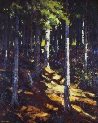
Carol Ann's painting by Robert Henri (wooded path) I think we hiked through this path!
and my selection by Fairfield Porter's View with Sailboat
I challenge any one else to join us for the fun of it! Feel free to post your results on my Festive Fibers Facebook page
L-R CA, me, CH Watching the sunset over the Monhegan Harbor


Thursday, February 13, 2014

Time and the Ginger Ottoman

These late fall and winter months I have been working on a fun project.  It is a custom order, and most unusual, I have had a luxuriously long amount of time to work on it.  The client is not yet in their beautiful new home, (being built) and I have Monday through Friday commitments that are not felt making. (aka a new job)  So the designer Laurie McDowell, who met me many years ago at an ACC St.Paul Craft Show, commissioned this piece for her client.  It will eventually be added to their collection of many other wonderful treasures in their new home in South Dakota.
I won't even call this project a labor of love because it wasn't really laborious, (aside from the actual felt making and you know what that is like!)  No, it was a lovely slow process.  And I am thankful to have a client who also had that luxury!

It gave me time to process, finding time in my weeks to play in the studio.  Time to order and wait for certain supplies to arrive.  Time to think about the adorable feet and what kind of pattern should bedeck them.  Time to work up colors for the flowers based on Laurie's color palette.  Time to hand felt the flowers and hand shape them.   Time to leave them pinned around the top, and occasionally pass by the piece or study and look at it from a different angel and then re-pin a flower into another place instead.  Time to cut and sew the check felt fabric.  Time to wait for my carpeter to cut the wood pieces.   Time to drill and a-fix.  Time to upholster.  And then finally, time finally to sew the flowers into their chosen place.  I did this mostly over weekends.  As general life stuff softly swirled around us, our new dog, visits with parents and family, celebrating holidays.  During all those activities, the Ginger Ottoman gently kept becoming more tangible.  It is finally done, I pack it up soon and send it out for the client to wait to move into their home, and finally open the box, lift the  piece out and celebrate.  I can't wait to see it in it's home.  Here are a few more close-up shots.


Wednesday, February 5, 2014

Blue is the Buzz Word for 2014 Color Trends

Checking my inbox and headlines this morning I noticed an MSN post on the trend and style updates from the Stockholm Furniture Fair. The fair is this week, trend reports hit the news media up to two months ago preparing fair-goers (designers) what to get excited about. It was also trending on Bing, Yahoo and Xinhua e-news search engines:  The below report is directly from Yahoo! News.
        Palette by Jan Rundgren

Palette by Jan Rundgren
Stockholm Furniture & Light Fair is underway, displaying the very best in Scandinavian interior and industrial design. Here is a quick overview of the key interior trends for 2014 and 2015, as selected by designer and trend expert Jan Rundgren.
Pure classics
Interiors are becoming more individual, and this trend encourages the mixing of styles to create a more personal look. Color palettes are discreet and the trend features a lot of warm metal, white marble and stone.
Secret garden
Floral trends are in fashion for 2014 / 2015 and this applies to interiors too. The Secret Garden trend will see contemporary romantic vintage pieces mixed with contemporary furnishings and vibrant colors mixed with neutrals. Flexible furniture suitable for both indoor and outdoor use will become increasingly popular.
Natural elements
Nordic design is famous for its contemporary use of natural materials, and the coming season will embrace that trend, focusing on materials such as stone, wood and glass. Creations will remain contemporary thanks to the combination of natural materials like leather and wood with metals. Techniques such as basket weaves, plaited details and washed linen will be prevalent, while color palettes will remain neutral.
Aqua marine
An update of the traditional maritime décor scheme, the Aqua marine trend sees blue, green and turquoise colors teamed with white, and it will be on everything from chinaware to upholstered furniture. Painted wood is the most dominant material for furniture in this style, with the gray ‘driftwood' wooden furniture effect becoming increasingly popular.
I love color trends, Blue is the buzz word for this year (and guessing that we have had all forms of blue and brown in our market place for the past 6 years or so), forecasters identify the transition of color in the marketplace over time.(from one year to the next)  Well, looking at the above palette, I am amused by the color selection in this trend forecast. 
Like all things fashionable, and for those of us "old enough" to experience such phenomena, color trends are really fashion trends.  What goes around comes right back again, just give it time.  Believe it or not this was THE color palette of the late 80s early 90s.  The very same grouping of color used EVERYWHERE in industry that inspired me to leave the commercial textile industry!  Yup, home furnishings color of the time became so homogenized, that I needed to have my own color voice.  Like tunic shirts and leggings with booties, all we need are the hair styles and we are right back there. 
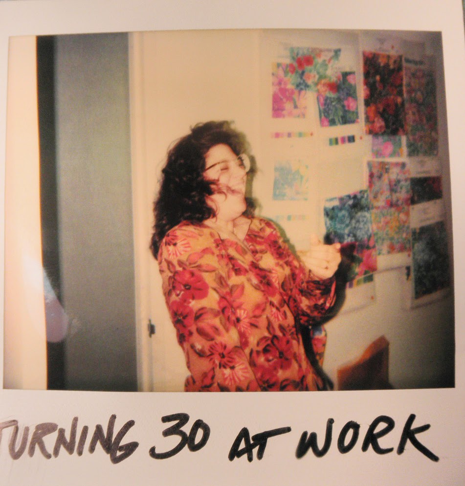
Me in the Studio of TexUnion USA, being surprised for my birthday.  Look at the color-ways on the wall!  Oh and my big hair, and bold jacket, and big glasses, this was 1991.  Oh and yes that is a polaroid picture!  Talk about retro. 
And I am not the only one out there with this observation, (Read the Quad Cities posting about their impression as well).
I implore creative designers everywhere to BE creative and add your pop and throw colors into the mix.  Please juxtapose textures, negative space and whites.  Look to other media for trend as well and stir up this palette.  Be a leader not a follower and put your spin on this palette, stick some real retro looks with these colors (think 50s and Scandinavian) it will work, really.
 Here is what I mean by how these colors mix. 
The above photo is from artist Janette Schuster, of Visual Apothecary, who has quite a collection of 50s dish wear and home accessories.  Would you agree about Jan Rundgren's color palette working with retro?

Monday, October 21, 2013

To-Do List # 1 (Done)

Hat Band for Steven's leather hat.  Attached, boxed and mailed today.  It should arrive in Virginia in two to three days.  I can't wait to get a photo of it on Steven's head!  And yes Alpaca lovers, this is the second time I have felted with this fiber.  It is very fuzzy! great for the band that gets to replace a furry fox band!

Thursday, October 17, 2013

To-Do List #2 & #3


Did I mention that I have weekends back again?  And when one is motivated, how much one can actually get done over a weekend?  
#2
I have had this bolt of turquoise fabric I won as a final contestant in the Norwalk Sofa Design Contest two years ago!  Wow yes, that was two years ago when I met Candice Olson.  So I finally made something of the 8 yards a fabric; a beautiful slipcover (shown here un-hemmed and missing a couple of little zips), for Buddy's chair in the kitchen.  The throw on it's arm is from last year's Threshold Collection of home decor at Target, and my inspiration point of colors to pull together for the porch and kitchen colors, the wall color - a coral rose - while looks OK needs repainting and will become more of a cantaloupe color, the two back pillows are my OLD Festive Fibers products, KNIT pillows, which frame a beautiful pillow I have had on my Etsy shop.  That felt piece for the pillow front was actually a demo felt I did during a class at NEFS.

#3
Studio chairs:  I have owned these funky wooden dinette chairs since I was in college.  I bought the set at a HUGE Salvation Army in Queens NY.  The furniture part was like a 3 floor warehouse - amazing.  They have been my kitchen chairs in many lives - 93rd St., Edison, and now Alstead.  Whenever the mood struck I changed the fabric slip seats, and about 15 years ago they were relegated to being my studio chairs.  I have never painted them, until now.   I have a great color scheme in mind for my studio redo (another # on the To-Do List), and I had this pile of samples which I cut and sewed into patchwork.
Here are the chairs, either trash or re-cycle?...
Very cool, as this is the first time I ever noticed the inventory dates on the bottoms, all starting at 1958-1960, and believe me they had at lease 6 layers of slipseat covers, one stapled right over the last.  Not any more, that old stuff removed completely and then a coat of fresh coral paint and some spray polyeurethane, can you say...
 Fabulous!
What do you think?

Wednesday, October 16, 2013

To-Do Lists

Wow the last post date was a long time ago!  Well a lot of life has certainly been happening, good things all, but it has made my posting time fall to the way side.  So no more time to spare, in the next couple of weeks I will catch you up with all the things I am finally catching up to!

 Do we all have To-Do Lists?  The Oxford Dictionary says:


Definition of to-do list in English

to-do list

Syllabification: (to-do list)

noun
a list of tasks that need to be completed, typically organized in order of priority

I tend to agree with this definition,  especially the part about organized in order of priority.  It is a beautiful thing when we are flexible enough to reorganize these lists without too much internal angst.  So as I have begun to chip away at my to-do list it really is not in any particular order, but boy oh boy, is the sense of checking something off exhilarating!  Bam! You're done!  In second grade, Mrs Ceretto gave us gold stars for doing the things we were supposed to do.  In my niece's first grade class they get a certain colored card at the end of each day based on a day well done (behaved, homework done etc) or not so well done; green, yellow and red.

So one of the few things on my list has been to make a new hat band for a dear art friend, Steven Summerville of Virginia's Dream Pottery. (if you visit his facebook page you will see why we love each other!)  Well, more than a year ago, Steven asked me if I could make a new band for a favorite hat.  His doggie chowed on the original a fox fur.  The hat being a favorite he wondered if I  might I use fiber from his beloved alpaca Kaboodle, who had passed away the year before.  I said "Steven, I would love to do this for you as long as you are not in a rush, as my life is so full."  No problem Nicole no problem...well sadly I missed last year's cold winter season, and darn-it I refuse to miss this year.  While we had a couple of chilly mornings here in NH, I know it is still on the warm side in Bumpass Virginia!  So Steven, here it comes.  

Here are a few pictures of the band being laid out, I will felt it probably tomorrow, and will then attach it to the cap style hat.  I hope it comes out like it looks in my head... I want to stuff it as I attach it so it has some depth and roundness, as it is replacing a fluffy foxy fur, so I want to keep that silhouette.  Steven, as you can see you have Buddy's approval! (By the way, this is the first time he has been with me when I lay out fiber in the studio, he was very very interested in what that fuzzy stuff was, sticking his head into my bins I had on the floor, where as his usual position he takes in the studio is upside down sleeping on a chair) I will felt this in the next day or so, and then attach the band to the hat, I hope just in time for the real cold that comes this time of year!


I will post a couple of more pictures as the hat finishes. 

Tuesday, March 5, 2013

The Printmaking Begins! Experiment #1

Here we go, I had a very productive day last week and am pretty pleased with my first trial.  I definitely learned a few things, and as students of mine know from classes I teach, have given myself a healthy bit of self-critique.  To coin Martha, "It's a good thing" (critiques, that is!)

As my inspiration was wood block printing, which I am still planning on doing, I thought it very efficient to try the block carving and printing using a much easier type of block to start.(mostly at the moment my spare time is so limited I am purely thinking of efficiency)  So I used rubber blocks.  They are super fast to cut and I can do the preliminary technique trials on them and then get into the wood idea - that pulled me into this new (but not foreign for me) medium - as I feel more confident.  In all color theory classes I teach I always encourage students to get to know the color range of your medium; watercolors, dyes, fiber, oils, pencils, whatever the medium, do some sort of color trials.  This is to know where your tubes or tubs of pigments will take you.  (I look for restrictions too, can I get my favorite brights?  Is color clean? and if not I try to find a different brand or do some more blending)


So things I tried and learned.  First was don't forget to flip your tracing (to reverse it)  While this scene looks basic, for many folks it really is an actual scene on Monhegan Island.  oops!  But for my first trial no big deal. Second, I tried brushing the color, watery, onto the block with brushes, but it was too soft -and while that can be pretty it was not the look I was going for.  So since I couldn't find my brayer, (I have one, just where it was? well you know how that goes) I used a sponge. 
Third is, find all your tools!  I don't mind the spongey quality of the inks but also not the look I am going for, so I went out and bought another brayer.  I plan on using the same block later in this week to try more color blending, so I will post the next grouping.  I also want the stamping elements (the little red flowers) to be more opaque.  I am using all water based inks and acrylics, so we will see how this works out. 

Wednesday, February 27, 2013

Printmaking and Textiles

If you have been following my ruminations here and on the Festive Fibers Facebook page, you will notice my newest interest in the medium of Printmaking.  Sure, as a textile designer and trained artist I have done some sort of printing over the years, lino-cut, silk screen, relief printing, stamping, etc. But as a textile designer I have never really focused my creative powers to this medium, which is funny because I have always loved the idea of silk screening my own fabrics, and I design patterns to be printed on fabrics.  But I never really played with that medium.  What was it that pushed my fabric design into feltmaking?  Well that's easy, my love of wool!  But as I have been thinking about my art and my personal history, I have begun to wonder about the printed surface again. 

A couple months ago I spent some time with my parents talking about a print they have and what they want to do with it, sell or donate?  I must say this very large print was a piece of art that hung in our house during my most artistically formative years.  Its bold graphic shapes and it bold colors repeated all the things of the colorful graphic art I was exposed to in the late sixties and seventies.  As I helped them find a value online,
we found the artist's website and then watched how Carol Summers actually printed this.  We watched this video on his site, fascinated by all the things (unconventional, in my mind) Summers did in achieving his print techniques.  From printing on front AND back, laying down heavy ink to get texture, rolling ink on the paper and blocks, spraying the inks with spirits to DYE the paper fibers and use his blocks like jigsaw puzzles, all struck me as something very interesting.  Sure I have watched wood block printing in the classical way, where many blocks were carved , then each printed with a different color in register onto paper.  My mother did this kind of printmaking.  I was never really interested in the slow carving process.  (remember - instant gratification me?)  So the thought of combining an array of surface techniques really speaks to me.  I have watched videos online of amazing artists doing traditional techniques so I may learn a bit of what I like an don't like about the processes.  Two amazing videos I found on YouTube are a video of Santa Cruz artist Bridget Henry
creating her prints.  15 carved blocks printed in registration...sounds to me like screens and traditional hand block fabric printing in textiles.  So I kept looking and found more beautiful techniques.  This one is a beautiful video of traditional Japanese Ukiyo-e block printing by master printer Keizaburo Matsuzaki. These techniques show me tonal work and the use of thickeners to hold soft water based paint on the surface of a block.
My own learning process is exciting to me.  I feel energized by my own creative process.  Equally exciting is what we can learn online - for free! There is so much more out there.  I have just returned from an art supply shopping trip, and am gearing up for a trial print run.  Stay tuned and I will post my experiments!